Image optimization for the web: formats, sizes and lazy loading
Image optimization means sending each screen the smallest image file that still looks right. That comes down to the right format, the width the screen draws, a compression budget, and loading at the right moment. We ran one 9.8 MB camera photo through each step and watched what Chromium downloaded. Part of the image API.
By Sahadat HusainUpdated 23 min readEngineering

Image optimization in 7 steps
Here is the whole job, in the order a page needs it. Each step has a section below with the measurement behind it.
Pick the format: AVIF, with WebP or JPG behind it
A picture element lists AVIF first, and each browser takes the first format it can read.
Set width and height on every img
The browser reserves the space before the file arrives, so nothing on the page jumps.
Serve each screen its own width
List several widths in srcset and the width of the slot in sizes.
Compress to a quality or a byte cap
Auto quality suits most photos; a Max file size suits a page with a budget.
Lazy load what starts below the first screen
Add loading="lazy" there, with a colour or a tiny blurred copy as the placeholder.
Load the LCP image first
Give the largest image at the top fetchpriority="high", and never lazy load it.
Cache it for a year
Put a version in the file name and send Cache-Control: max-age=31536000, immutable.
- The camera file9.8 MB
- 1920 wide, JPG140.3 KB
- 800 wide, JPG35.2 KB
- 800 wide, AVIF17.6 KB
The camera file is 557 times the size of the phone’s. On a 390-pixel screen at 2x, the larger files add bytes and no detail you can see.
Choose the format: AVIF first, with a fallback
For photos on a site you run, serve AVIF and keep WebP or JPG behind it. Take the 800-pixel file our phone downloaded. It was 17.6 KB as AVIF, 22.4 KB as WebP and 35.2 KB as JPG, each at Auto.
- AVIF17.6 KB
- WebP22.4 KB
- JPG35.2 KB
The picture element offers all three. The browser reads its sources in order and takes the first type it supports. The img inside is the fallback, and it carries the alt, the width and the height.
<picture>
  <source type="image/avif" srcset="photo-800.avif">
  <source type="image/webp" srcset="photo-800.webp">
  <img src="photo-800.jpg" alt="A boat on a lake at sunset"
       width="800" height="448">
</picture>Why AVIF wins on photos, and when PNG or lossless WebP is the better pick, is in best image format. To make the files, the WebP converter turns a JPG or a PNG into WebP, and the AVIF converter turns it into AVIF.
HTML image size: set width and height on every image
Give every img its width and height attributes. The browser then knows the shape before the file arrives and holds the space open. Leave them out, and the text below jumps when the picture lands.
We measured the jump. Our test page put a block of text, then an image that arrived 600 ms late, then more text, on a 390-pixel phone. Without width and height, Chromium 149 scored a cumulative layout shift (CLS) of 0.215. With them, it scored 0.
- No width or height0.215
- Width and height set0
- Good, per web.dev0.1 or less
One image took the page past web.dev’s good line of 0.1, into “needs improvement”. The fix is two attributes. Even so, the HTTP Archive’s 2025 Web Almanac found at least one unsized image on 62% of mobile pages.
<img src="photo-800.jpg" alt="A boat on a lake at sunset"
     width="800" height="448">

<style>
  img { max-width: 100%; height: auto; }
</style>How to change image size in HTML
Change the size an image shows at with CSS. Leave the width and height attributes at the file’s own pixels. MDN’s img reference describes them as the image’s intrinsic size, in whole numbers with no unit. CSS then sets what the reader sees.
- width: 100%; height: auto fills the column and keeps the shape.
- max-width: 400px caps the image on a wide screen.
- aspect-ratio: 1 / 1; object-fit: cover crops it to a square without stretching it.
Shrinking an image with CSS does not shrink the download. The browser still fetches every pixel of the file. To send fewer bytes, send a smaller file, which is what srcset does.
Responsive images: srcset and sizes
A srcset lists the same picture at several widths, and sizes tells the browser how wide the slot will be. The browser multiplies the slot by the screen’s pixel density, then picks a file. Our list has five widths, from 400 to 1920.
<img src="photo-800.jpg"
     srcset="photo-400.jpg 400w, photo-800.jpg 800w,
             photo-1200.jpg 1200w, photo-1600.jpg 1600w, photo-1920.jpg 1920w"
     sizes="(min-width: 720px) 720px, 100vw"
     width="1920" height="1076"
alt="A boat on a lake at sunset">Which file each screen downloaded
We opened that markup in Chromium 149 on five screens and logged the one request each made. Every screen took the smallest file at least as wide as it needed, and no file was more than 11% wider than its slot.
| Screen | Slot × density | File taken | As AVIF | As JPG |
|---|---|---|---|---|
| Phone, 390 pixels at 1x | 390 × 1 = 390 px | 400 wide | 6.3 KB | 12.2 KB |
| Phone, 390 pixels at 2x | 390 × 2 = 780 px | 800 wide | 17.6 KB | 35.2 KB |
| Phone, 390 pixels at 3x | 390 × 3 = 1,170 px | 1200 wide | 32.9 KB | 67.0 KB |
| Laptop, 1440 pixels at 1x | 720 × 1 = 720 px | 800 wide | 17.6 KB | 35.2 KB |
| Laptop, 1440 pixels at 2x | 720 × 2 = 1,440 px | 1600 wide | 51.2 KB | 104.9 KB |
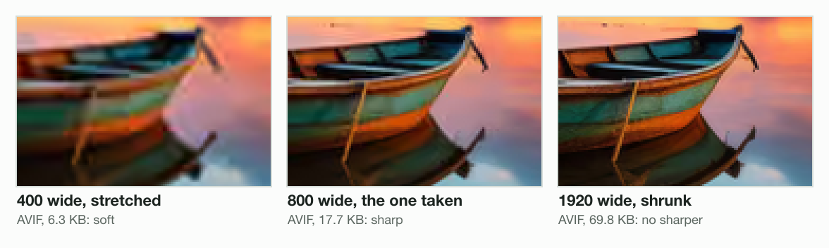
Without the srcset, every screen gets whatever src names. Serve the 1920 file to everyone, and the phone pays 69.3 KB. It shows no more detail than the 17.6 KB file: 3.9 times the bytes for nothing. A phone at 3x took the 1200 file and a laptop at 2x the 1600, so keep a width near each of those.
| Width | Height | JPG | WebP | AVIF |
|---|---|---|---|---|
| 400 px | 224 px | 12.2 KB | 8.6 KB | 6.3 KB |
| 800 px | 448 px | 35.2 KB | 22.4 KB | 17.6 KB |
| 1,200 px | 673 px | 67.0 KB | 42.8 KB | 32.9 KB |
| 1,600 px | 897 px | 104.9 KB | 63.6 KB | 51.2 KB |
| 1,920 px | 1076 px | 140.3 KB | 85.5 KB | 69.3 KB |
For a lazy-loaded image, sizes="auto" lets the browser measure the slot itself. MDN says it only works with loading="lazy". caniuse counts 74.1% of users whose browser supports it, so keep a written sizes list for the rest.
Compress to a budget: quality or a byte cap
Compression sets how many bytes each pixel costs. You can pick a quality number, or name a byte cap and let the encoder find the quality that fits.
Quality: where the curve bends
Our engine’s 1200-wide JPEG fell from 258.3 KB at quality 95 to 67.0 KB at Auto, 74% smaller. Its PSNR, a decibel score of how close the pixels stay to the source, fell from 44.3 to 37.2 dB. Going lower buys less. From Auto to quality 40 saved 37.2 KB more and cost 3.0 dB. Each decibel given up below Auto saved under half the bytes of one above it.
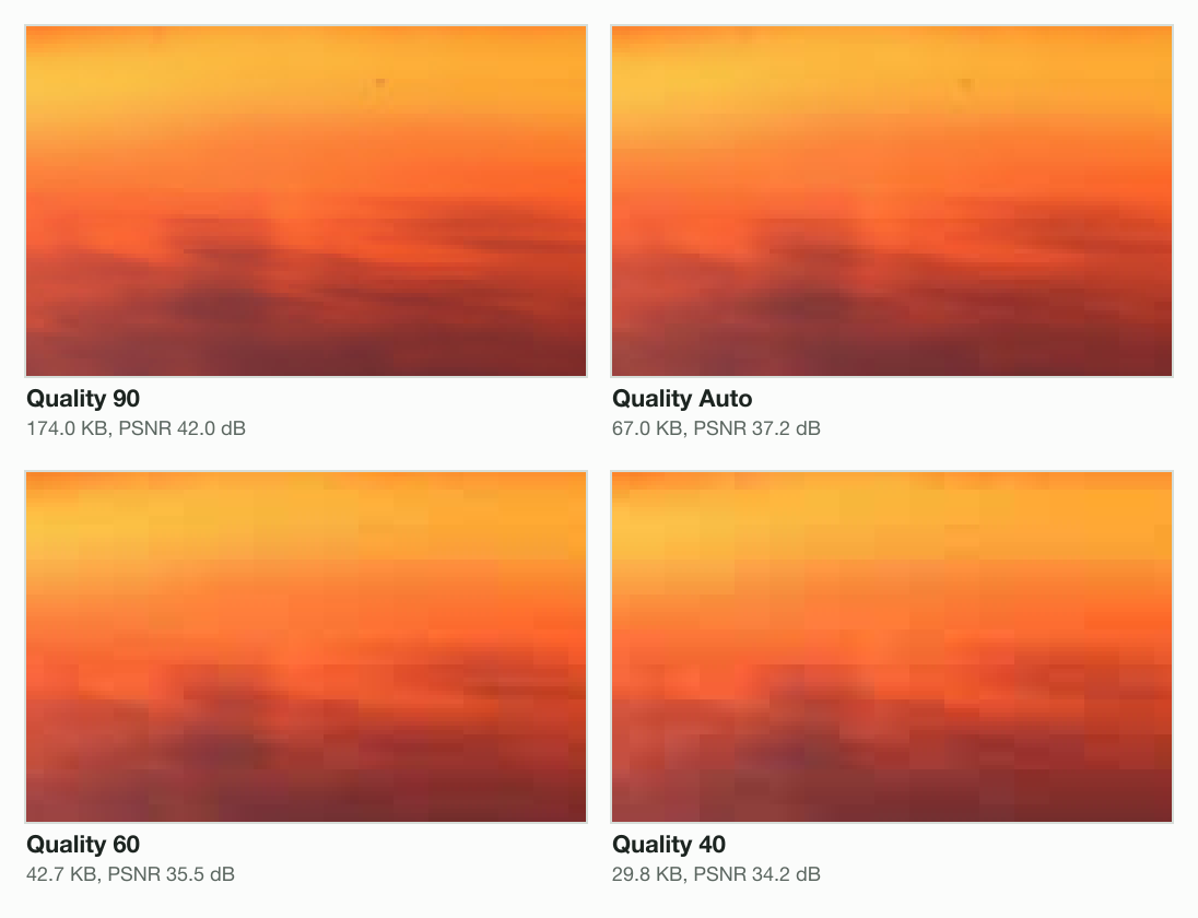
| Quality | Size | PSNR |
|---|---|---|
| 95 | 258.3 KB | 44.3 dB |
| 90 | 174.0 KB | 42.0 dB |
| Auto | 67.0 KB | 37.2 dB |
| 60 | 42.7 KB | 35.5 dB |
| 40 | 29.8 KB | 34.2 dB |
A byte cap: Max file size
A byte cap fits a page budget. We gave the photo a 50 KB Max file size at 1,600 pixels wide. Our engine searched for the quality that fits. The JPG landed at 49.8 KB, the WebP at 49.4 KB and the AVIF at 48.0 KB, all still 1,600 wide.
PSNR under one 50 KB cap
- AVIF, 48.0 KB38.6 dB
- WebP, 49.4 KB36.3 dB
- JPG, 49.8 KB35.3 dB
At the same bytes, the AVIF kept the most detail. That is the case for a cap plus a modern format. The budget holds, and the format decides how good the picture looks inside it. The image compressor takes the same cap in its Advanced settings.
Lazy loading images, and what to show while they load
Add loading="lazy" to images that start below the first screen. The browser then waits to fetch each one until the reader scrolls near it. Support is close to universal: caniuse counts 95.82% of users.
We built a test page of 12 photos, each under a block of text. Then we opened it on a 390 × 844 phone at 2x. Without the attribute, Chromium fetched all 12 as the page loaded. With it on every image but the first, it fetched 4 and left 8 for later.
Without loading="lazy"
12 of 12 images fetched with the page
With loading="lazy"
4 of 12 fetched with the page, 8 on scroll
- Fetched as the page loads
- Fetched only on scroll
- The first screen, 844 px
- 1,250 px below the first screen
The last image fetched started 915 pixels below the screen, and the first one held back started 1,502 pixels below. That matches web.dev’s account of Chrome. It fetches a lazy image once it comes within 1,250 pixels of the screen on a fast connection, or 2,500 on a slow one. At 17.6 KB a photo, the 8 deferred images were 140.8 KB a reader pays for only by scrolling.
<picture>
  <source type="image/avif" srcset="photo-800.avif">
  <img src="photo-800.jpg" loading="lazy" decoding="async"
       width="800" height="448"
       alt="A boat on a lake at sunset">
</picture>Lazy load placeholder: a colour or a tiny blurred image
A placeholder fills the reserved space until the photo arrives. The cheapest is a background colour. The next step up is a tiny copy of the photo, stretched and blurred.
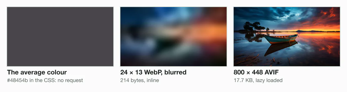
Our tiny copy is 24 × 13 pixels, a WebP of 214 bytes. As a data URI it is 311 characters, small enough to sit inline so it paints with the page. The colour, #48454b, is the mean of the photo’s pixels, which sharp reports in one call.
<picture>
  <source type="image/avif" srcset="photo-800.avif">
  <img src="photo-800.jpg" loading="lazy"
       width="800" height="448" alt="A boat on a lake at sunset"
       style="background: #48454b url('data:image/webp;base64,UklGR…')
              center / cover no-repeat">
</picture>
The LCP image: fetchpriority, and never lazy
The largest image in the first screen is usually the page’s Largest Contentful Paint (LCP), the Core Web Vital for loading. web.dev’s LCP guide counts 2.5 seconds or less as good and over 4 seconds as poor, at the 75th percentile of page loads.
Images are the LCP on 76.0% of mobile pages and 85.3% of desktop pages, per the Web Almanac 2025 performance chapter. The same chapter found 16% to 17% of pages lazy-loading their LCP image, and fetchpriority="high" on 17% of mobile pages with an image LCP.
Is the image in the first screen?
- Yes
Is it the largest thing there?
- Yes
fetchpriority="high"
Never loading="lazy": this is the LCP image
- No
No attribute
Eager is the default; it loads at once
- Yes
- No
loading="lazy"
With width, height and a placeholder
Never put loading="lazy" on the LCP image: web.dev’s guide to optimizing LCP says that always delays it. Give it fetchpriority="high" so the browser fetches it ahead of other images. caniuse counts 93.74% of users whose browser reads the attribute; the rest ignore it.
<picture>
  <source type="image/avif" srcset="photo-1600.avif">
  <img src="photo-1600.jpg" fetchpriority="high"
       width="1600" height="897"
       alt="A boat on a lake at sunset">
</picture>Keep the LCP image in the HTML as an img. When script inserts it, or a CSS background holds it, the browser’s preload scanner cannot find it early. The same guide counts that as delay.
A CDN for images: resize at the edge, cache for a year
A CDN for images keeps copies of your files on servers near your readers. An image CDN also resizes and converts on request, usually from parameters in the URL, and caches each result.
The browser asks
photo.jpg?w=800
Accept: image/avif, image/webp
The edge looks
A cached copy is sent
from the nearest site
A miss goes back
Resized and encoded once
in a format it accepts
The copy is kept
Cached with the header
for the next reader
When one URL can return AVIF or WebP, the cache must key on the browser’s Accept header. Otherwise a browser can get a format it cannot read. The Next.js docs make a related point: a proxy or CDN in front of its image optimizer must forward that header.
The cache header matters with or without a CDN. MDN recommends max-age=31536000 with immutable for files whose names change when their contents do, such as photo.3f9a2c.avif. The max-age lets a browser reuse the file for a year without asking again; immutable, MDN adds, also skips the recheck when the reader reloads the page.
Cache-Control: max-age=31536000, immutableImage to base64: when a data URI costs more than it saves
Base64 turns an image’s bytes into text, so the image can sit inside HTML or CSS as a data URI. Every 3 bytes become 4 characters. Our 800-pixel AVIF went from 17,647 bytes to a data URI of 23,555 characters, 33% more.
Then the surprise: HTTP compression wins almost all of it back. Gzipped, the data URI came to 17,722 bytes, only 76 more than the gzipped file. With Brotli the gap was 67 bytes. Base64 uses 64 symbols, and the compressor packs each one back into about 6 bits.
As sent with no compression
- The file17,647 bytes
- The data URI23,555 bytes
With gzip
- The file17,646 bytes
- The data URI17,722 bytes
With Brotli
- The file17,598 bytes
- The data URI17,665 bytes
What a data URI really costs
So the bytes on the wire are not the problem. The costs are where the image lives:
- No cache of its own. A file is fetched once and reused on every page. A data URI comes again inside every page or stylesheet that holds it.
- No lazy loading, no priority. The image arrives inside the document, so its bytes come before the content after it, even if the reader never scrolls that far.
- A heavier document. Once decompressed, the HTML or CSS carries all 23,555 characters, and the browser parses every one.
Inline only what is tiny and needed at once, like our 214-byte placeholder. Serve everything else as a file.
How to turn an image into base64
import { readFile } from 'node:fs/promises';

const b64 = (await readFile('photo.webp')).toString('base64');
const uri = `data:image/webp;base64,${b64}`;Framework helpers
Most frameworks wrap these steps in one component. Read its defaults before you trust it: a default format or quality decides your bytes on every page.
Next.js: the next/image component
Next.js’s Image component writes the srcset, lazy loads by default and serves resized copies from its own endpoint. It needs src, alt, and width and height, or fill. The Next.js 16 docs set quality to 75 by default and require a qualities list in the config. The formats setting defaults to WebP alone.
Your component
src, width, height,
alt and sizes
The srcset
Widths from deviceSizes,
640 to 3840 by default
The endpoint
/_next/image resizes
and encodes on request
The cache
4 hours by default
minimumCacheTTL 14400
// next.config.js
module.exports = {
  images: {
    formats: ['image/avif', 'image/webp'],
    qualities: [75],
  },
};import Image from 'next/image';
export function Hero() {
return (
<Image
src="/photo.jpg"
alt="A boat on a lake at sunset"
width={1920}
height={1076}
sizes="(min-width: 720px) 720px, 100vw"
fetchPriority="high"
/>
);
}Without sizes, the docs say the browser assumes the image is as wide as the viewport, and Next.js writes a short 1x and 2x srcset. Give sizes whenever the image is narrower than the screen.
Automate it: the image API and the MCP server
Five widths in three formats is fifteen exports for every photo. Our image compression API makes them from one upload: send the file once, then ask for every width in one batch.
Upload once
POST /v1/uploads,
then PUT the bytes
One batch
A job for each width,
with resize and format
Wait
GET /v1/batches/{id}
until none is queued
Collect
GET /v1/jobs/{id}/result
a signed link each
const api = 'https://api.blinkimg.com/v1';
const auth = { Authorization: `Bearer ${process.env.BLINKIMG_KEY}` };
const json = { ...auth, 'Content-Type': 'application/json' };

// One batch: the same upload at every width, AVIF at Auto
const widths = [400, 800, 1200, 1600, 1920];
let batch = await fetch(`${api}/batches`, {
  method: 'POST',
  headers: json,
  body: JSON.stringify({
    jobs: widths.map((width) => ({
      uploadId,
      options: { format: 'avif', resize: { width } },
    })),
  }),
}).then((r) => r.json());

// Wait until no job is queued or processing
while (batch.counts.queued + batch.counts.processing > 0) {
  await new Promise((r) => setTimeout(r, 500));
  batch = await fetch(`${api}/batches/${batch.id}`, { headers: auth })
    .then((r) => r.json());
}

// A signed link for each file
for (const job of batch.jobs) {
  const { url } = await fetch(`${api}/jobs/${job.id}/result`, { headers: auth })
    .then((r) => r.json());
  console.log(job.result.width, url);
}Large originals are their own problem. How the engine resizes a 400-megapixel JPEG on a small server is in input image exceeds pixel limit.
From an AI coding agent
In Claude, Cursor or another AI coding agent, the image compression MCP server does the same from a prompt. Connect it, then ask:
Convert every PNG in ./public to AVIF under 100 KBMeasure a page with the website image analyzer
Check a live page before you change it and again after. Our website image analyzer loads a public URL in Chrome at 1366 × 768, scrolls one screen at a time so lazy images load, and lists up to 60 images. For each one it records:
- Its natural size and the size it is shown at, so an oversized file stands out.
- Whether it sits in the first screen, and its loading attribute.
- Whether it has a srcset or a picture source, and whether it has an alt.
- What our engine saves on it, compressed during the same scan.
Load
Chrome at 1366 × 768
one screen at a time
List
Up to 60 images,
sizes and attributes
Compress
Each image through
our engine
Report
What each would save,
a score, a time estimate
The next step is one page: run it through the analyzer, fix the largest image first, and run it again.
The guides
Questions
- What is image optimization?
- Image optimization is sending each screen the smallest image file that still looks right: a modern format, the width the screen draws, sensible compression, and loading at the right time. In our test, a 390-pixel phone at 2x needed the 800-pixel AVIF of 17.6 KB, where the camera file was 9.8 MB.
- How could you optimize an image?
- Seven steps cover a page: pick AVIF with a WebP or JPG fallback, set width and height, serve each screen its width with srcset, compress to a quality or a Max file size, lazy load below the first screen, give the LCP image fetchpriority="high", and cache versioned files for a year.
- What is the best photo optimizer software?
- The best one fits where your images live. For a few files, use a web tool that lets you set a quality or a byte cap and shows the result. For a whole site, use the build step or an image CDN that resizes on request. For automation, use an API. Test it on your own photos first.
- Is image optimizer free?
- Many are. Blinkimg's web compressor is free, no signup. Every account also gets 500 free API credits a month: 1 to compress an image, 2 to convert one. Pro and Pro Max raise the limits. Image CDNs usually bill by images served or bandwidth, so read their pricing before you route a site through one.
- What size should images be for a website?
- As wide as the slot they fill, times the screen's pixel density. A 390-pixel phone at 2x needs about 780 pixels; a 720-pixel column on a laptop at 2x needs 1,440. List several widths in srcset, such as 400, 800, 1200, 1600 and 1920, and let the browser choose.
- How do I change the size of an image in HTML?
- Keep the width and height attributes at the image file’s own pixels, then size it with CSS: width: 100% and height: auto make it fill its column and keep its shape. CSS changes how large it looks, not what downloads, so serve a smaller file through srcset when it shows small.
- Should every image have width and height attributes?
- Yes. They let the browser reserve the image’s space before the file arrives, so the page does not jump. In our phone test, one late image without them scored a layout shift of 0.215, past web.dev’s good limit of 0.1. With them, it scored 0. CSS still controls the size it shows at.
- Should I lazy load every image?
- No. Lazy load the images below the first screen, and never the largest image at the top, which is usually the Largest Contentful Paint. web.dev says lazy loading the LCP image always delays it. In our test, loading="lazy" cut the images fetched with the page from 12 to 4 of 12.
- What is the best placeholder for a lazy-loaded image?
- A background colour costs nothing and stops the blank flash. A tiny copy of the image, blurred, shows its shapes and colours: ours was 24 × 13 pixels and 214 bytes as a WebP, small enough to inline as a data URI. Either way, set width and height so the space is reserved.
- Does base64 make images load faster?
- Rarely. A data URI saves one request, but the image can no longer be cached, lazy loaded or prioritised on its own. Base64 adds a third to the bytes, yet gzip wins nearly all of it back: our AVIF of 17,647 bytes gzipped to 17,722 bytes as a data URI. Inline only tiny images.
- How do I convert base64 to an image?
- Drop the data URI's prefix, such as data:image/webp;base64, and decode the rest back to bytes. In Node, Buffer.from(text, 'base64') gives the bytes to write to a file. In a browser, fetch() on the whole data URI answers a response whose blob() is the image. Save it with the extension the prefix names.
- Do I need a CDN for images?
- Not to start. A year-long cache header on versioned file names helps every site, with or without one. A CDN helps most when readers are far from your server, or when you want resizing and AVIF conversion on request. If one URL can return several formats, the cache must vary on the Accept header.
- Does Next.js serve AVIF images?
- Only if you ask. The next/image component's formats setting defaults to WebP alone. Set it to ['image/avif', 'image/webp'] and Next.js sends AVIF to browsers that accept it, with WebP as the fallback. Its docs note that each format is cached separately, so the cache holds both versions of every image.
- What is a good LCP time?
- 2.5 seconds or less at the 75th percentile of page loads, per web.dev; over 4 seconds is poor. The 2025 Web Almanac found an image as the LCP element on 76.0% of mobile pages, so the hero image's size, format and fetch priority are the first things to check.
- Does image optimization help SEO?
- Indirectly. Google’s Search docs say good Core Web Vitals align with what its core ranking systems seek to reward. Two of the three vitals often hinge on images: Largest Contentful Paint on how fast the main image loads, and Cumulative Layout Shift on whether its space was reserved before it arrived.