How to resize an image in HTML and CSS, tested in 3 browsers
Width and height on the img tag, one line of CSS, then a file the right size. We tested every method in Chromium, Firefox and WebKit. Part of the image resizer.
By Sahadat Husain18 min readEngineering

To resize an image in HTML, add width and height to the img tag in pixels, then add max-width: 100%; height: auto in your CSS. The attributes set the size and hold the space while the file loads. The CSS lets the image shrink on a phone without stretching.
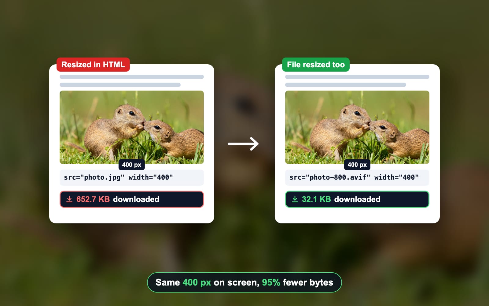
One thing HTML cannot do is make the file smaller. We showed a 652.7 KB photo 400 pixels wide in Chromium 149, Firefox 151 and WebKit 26.5, and all 3 downloaded every byte. Resize the file itself as well, and the page loads fast too.
<img src="squirrels.jpg" width="400" height="267"
     alt="Two ground squirrels in the grass">

<style>
  img {
    max-width: 100%;  /* never wider than its column */
    height: auto;     /* keep the shape when it shrinks */
  }
</style>| You want | Use | What we measured |
|---|---|---|
| A fixed size | width="400" height="267" | 400 × 267 in all 3 |
| To shrink on a phone, never grow | max-width: 100%; height: auto | 358 × 239 on a 390 px phone |
| To fill the column | width: 100%; height: auto | 688 px wide; a 400 px file went soft |
| A square card that does not stretch | aspect-ratio: 1 / 1; object-fit: cover | Filled, edges cropped |
| No jump while it loads | width and height, or aspect-ratio | 0 px moved, against 239 px |
| Fewer bytes | A file twice the display width | 32.1 KB AVIF, not 652.7 KB |
| The right file per screen | srcset and sizes | A 1200, 800 or 400 px copy |
How to resize an image in HTML with width and height
The width and height attributes set the size an image shows at, in CSS pixels. MDN’s img reference says each must be an integer without a unit. Set both, in the photo’s own shape, and the browser keeps that shape.
Find the photo’s own size
Any image viewer shows the file’s width and height in pixels. In the browser, select the image in DevTools and type
$0.naturalWidthin the Console: naturalWidth is the file’s own width. Without a size, the browser draws the file at those pixels. Our 1920 pixel photo made the test page scroll sideways at every screen width.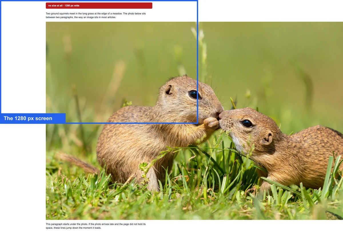
No size at all. The blue box is a 1280 pixel screen; the 1920 pixel photo runs past it to the right and below. Add width and height in pixels
Pick the width you want, then work out the height in the same shape: the file’s height × your width ÷ the file’s width. For our photo, 1281 × 400 ÷ 1920 is 267. Write the numbers with no unit:
width="400" height="267".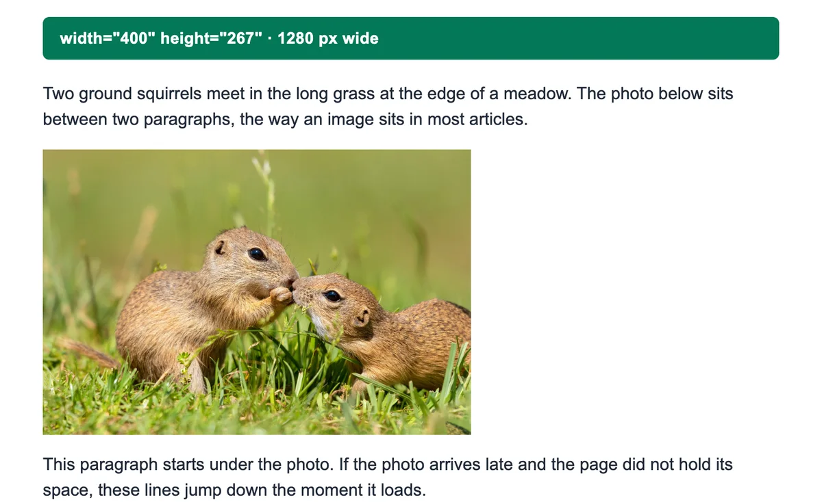
width="400" height="267". The photo shows 400 pixels wide, in its own shape. Let it shrink on small screens
Add
img { max-width: 100%; height: auto; }to your CSS. On our 390 pixel phone, the 400 pixel photo then fit the 358 pixel column at 358 × 239, with no sideways scroll.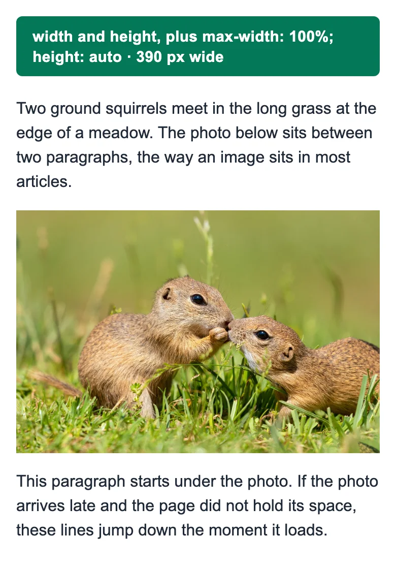
max-width: 100%; height: auto on a phone. The photo fits the 358 pixel column.
Can you use px, % or auto in the width attribute?
No. The HTML standard says the attributes must be valid non-negative integers, which means digits only. Some tutorials that rank for these searches still teach width="50%", width="750px" or height="auto". We tested all three. Each one draws, but 2 of them lose the space the browser holds while the photo loads.
| In the img tag | Drawn at (1280 px screen) | Valid HTML | Text moved on load |
|---|---|---|---|
| width="400" height="267" | 400 × 267 | Yes | 0 px |
| width="400px" height="267px" | 400 × 267 | No | 0 px |
| width="50%" | 344 × 230, half the column | No | 119 px |
| width="400" height="auto" | 400 × 267 | No | 267 px |
The browsers drop the px and read the number, so that one still works. A percentage or auto gives the browser no shape to hold, so the text below jumps when the photo lands. For a percentage, use CSS: width: 50% is valid there.
How to resize an image with CSS and keep the aspect ratio
To resize an image with CSS, set one side and leave the other on auto: width: 400px; height: auto. The browser works out the height from the file’s shape. On our page that drew the photo at 400 × 267, the same as the attributes.
/* One image: 400 pixels wide, never wider than its column */
.photo {
  width: 400px;
  max-width: 100%;
  height: auto;
}

/* Every image fills its column, even a smaller file */
img {
  width: 100%;
  height: auto;
}For a single image, the same rule fits in a style attribute: style="width: 400px; height: auto". A class keeps it in one place when several images share the size.
Use max-width: 100%, not width: 100%, when a file may be smaller than the column. width: 100% stretched our 400 pixel file to 688 pixels, where it goes soft. max-width: 100% kept it at 400. MDN notes that max-width overrides width, which is why the class above can set both.
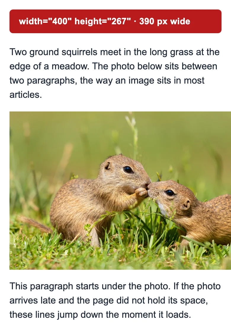
A fixed width breaks on a phone. With width="400" and nothing else, the photo stuck out of our 390 pixel screen and the page scrolled sideways to 416 pixels. max-width: 100% stops that: the image keeps its size on a wide screen and shrinks to its column on a narrow one.
To change the size at a screen width, put the rule in a media query. Keep the vw unit for full-screen images: width: 50vw is half the screen, not half the column.
.photo {
  width: 100%;
  height: auto;
}

/* From 768 pixels up, a fixed 400 pixels */
@media (min-width: 768px) {
  .photo {
    width: 400px;
  }
}Why is my width attribute ignored?
A width rule in your CSS is winning. The HTML standard turns the width and height attributes into presentational hints, which rank below every rule in a stylesheet. We stacked the rules one at a time on the same photo:
| On the page | Width it drew |
|---|---|
| width="400" alone | 400 px |
| Plus a stylesheet: img { width: 100% } | 688 px, the column |
| Plus style="width: 200px" on the tag | 200 px |
| Plus !important in the stylesheet | 688 px, the column |
So when an image ignores its width, look for a width rule in your theme, then for an inline style, then for !important.
Why does my image look stretched?
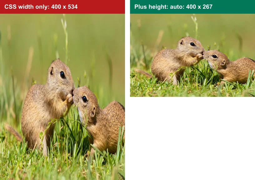
An image looks stretched when its width and height do not match the file’s shape. The most common cause is a height attribute left behind. A CMS writes the file’s own size, such as width="800" height="534", then a theme sets width: 400px. CSS replaces the width, but the height attribute still applies.
In all 3 browsers the photo drew at 400 × 534, twice as tall as its shape. Add height: auto next to the width and the browser works out the height again. The same page then drew 400 × 267.
A flex row can stretch an image too. align-items stretches every item to the row’s height by default, so a photo beside a long paragraph grows tall. On our 390 pixel phone, a 200 pixel wide photo drew 200 × 456. Setting align-items: flex-start on the row kept it at 200 × 133.
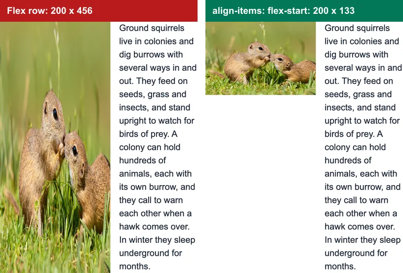
.row {
  display: flex;
  align-items: flex-start;  /* or align-self: flex-start on the img */
}How to fit an image in a box: object-fit and aspect-ratio
To fit an image in a box of another shape without stretching it, use object-fit. MDN lists fill as the initial value, which stretches the picture to the box. Our photo in a 400 × 400 square came out squeezed sideways.
- object-fit: cover fills the box and crops the edges. Use it for thumbnails, cards and avatars.
- object-fit: contain shows the whole picture and leaves bars on two sides. Use it for logos and product shots.
- object-fit: none keeps the file’s own size and crops it to the box.
- object-fit: scale-down uses none or contain, whichever draws the picture smaller.
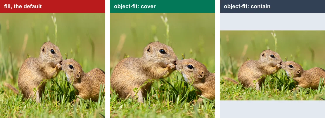
To choose which part cover keeps, add object-position. MDN gives its initial value as 50% 50%, the centre. object-position: 30% 50% keeps more of the left side.
For a box that keeps its shape at any width, add aspect-ratio. MDN describes it as the width-to-height ratio of an element’s box. With width: 100%, the box grows with its column and stays square:
.thumb {
  width: 100%;
  aspect-ratio: 1 / 1;   /* a square at any width */
  object-fit: cover;     /* fill it, crop the edges */
}Why set width and height if CSS sizes the image?
Set width and height so the page does not jump. The browser reads the two numbers before the file arrives and holds a box of that shape. Without them, the box is empty until the photo loads, then everything below it moves down.
We held our photo back 1.5 seconds on a 390 pixel phone. With only CSS width, the paragraph under it dropped 239 pixels when the photo landed. Chromium scored that one jump at a Cumulative Layout Shift (CLS) of 0.175. web.dev asks for 0.1 or less.
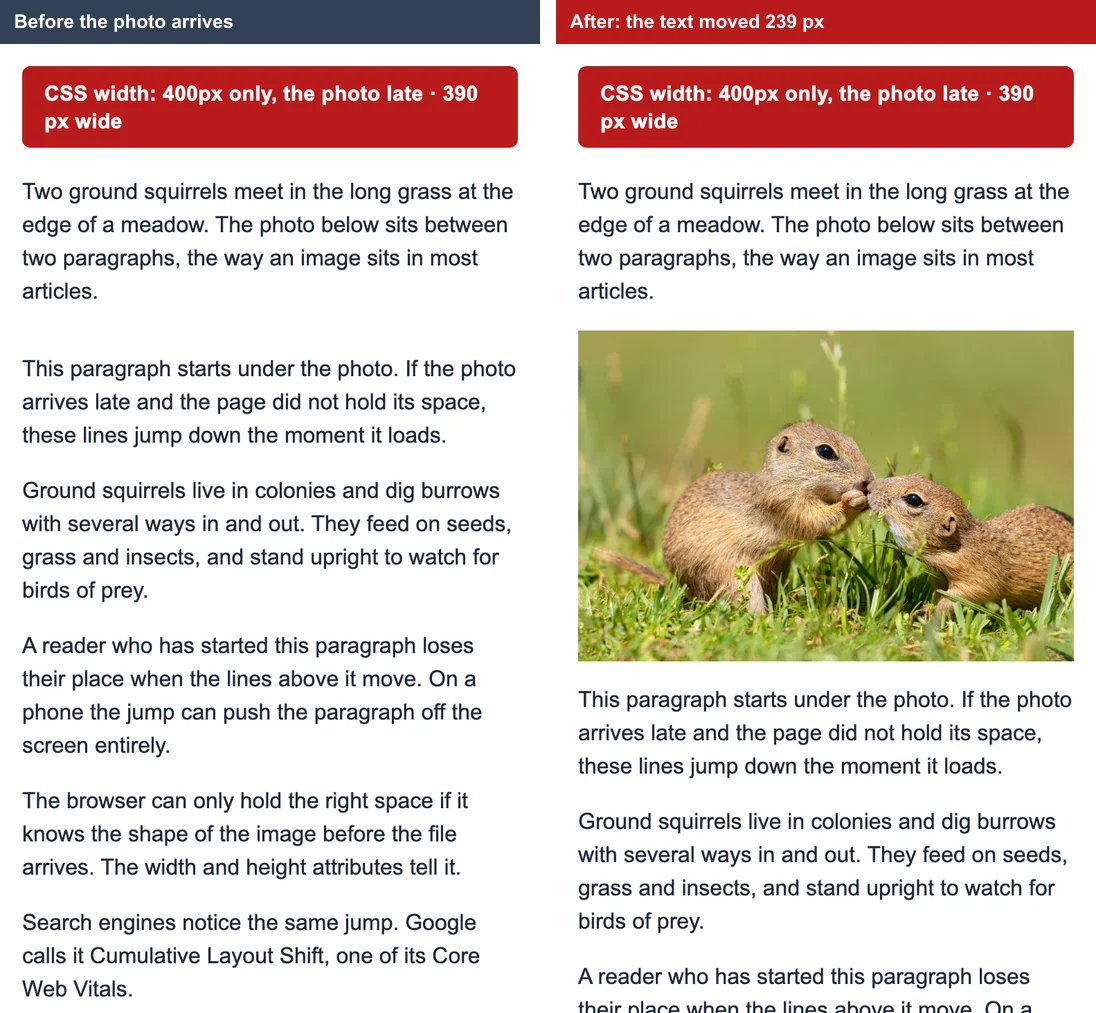
Pixels the text moved when the photo loaded, 390 px phone
- CSS width only239 px
- height="auto"267 px
- width="50%"119 px
- width and height0 px
- CSS aspect-ratio0 px
With width and height set, nothing moved and Chromium scored 0. On the 768 pixel tablet the CSS-only page scored 0.131, and on the 1280 pixel desktop the text still dropped 267 pixels. web.dev’s CLS guide names images without dimensions as the first common cause of a poor score.
Do width and height fight responsive CSS?
No, not since 2020. Browsers still use the two numbers as a size until CSS says otherwise, and they also read them as a shape. So with height: auto, the image takes its width from the CSS and its shape from the attributes, before the file arrives. Firefox 71 and Chrome 79 did this first, per Barry Pollard, and Safari 14 followed, per the WebKit blog. CSS aspect-ratio holds the space too, when you cannot edit the HTML.
Why lazy-loaded images need width and height most
Lazy loading makes the attributes matter more. With loading="lazy", the browser fetches the photo only as the reader scrolls near it, so its space must already be held. web.dev recommends width and height on every image, and lazy loading only for images outside the first screen. Leave the first big image on a page to load at once.
<img src="squirrels-800.jpg" width="400" height="267"
loading="lazy" alt="Two ground squirrels in the grass">Does resizing an image in HTML make the file smaller?
No. Resizing an image in HTML or CSS changes only how big it looks. Every browser we tested downloaded all 652.7 KB of our 1920 × 1281 photo to show it 400 pixels wide. To send fewer bytes, resize the file itself.
What the browser downloads to show the photo 400 pixels wide
- Original, 1920 px652.7 KB
- JPEG, 800 px61.0 KB
- WebP, 800 px54.1 KB
- AVIF, 800 px32.1 KB
Why 800 pixels for a 400 pixel slot? A screen with a pixel density of 2 draws 2 device pixels for each CSS pixel. A file twice the width stays sharp there. The 800 pixel JPEG was 91% smaller than the original, and the AVIF 95% smaller. Google’s Lighthouse flags an image when the file is at least 4,096 bytes bigger than its displayed size needs.
How to resize an image in HTML without losing quality
Show an image at its own width or smaller, never larger. HTML cannot add pixels. Our 400 pixel copy drawn 688 pixels wide came out soft beside the original at the same size.
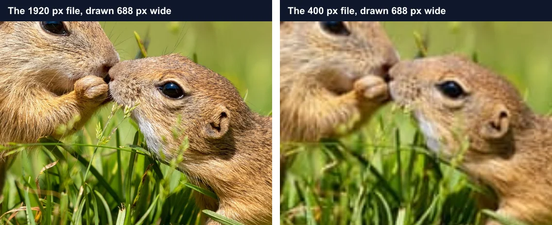
If the file is too small, start from a bigger original. Our guide on how to resize an image without losing quality measures what each method keeps.
Two kinds of image need no bigger file. A logo or an icon saved as SVG is drawn from shapes, not pixels, so it stays sharp at any width; give the svg a viewBox so it scales. For pixel art or a QR code shown larger, image-rendering: pixelated keeps the hard edges: each file pixel becomes a block of screen pixels.
How to serve the right image size to every screen
To send each screen a file its own size, list several copies in srcset and tell the browser the slot’s width in sizes. The browser then picks one. MDN’s responsive images guide walks through both attributes.
<img src="squirrels-800.jpg"
     srcset="squirrels-400.jpg 400w,
             squirrels-800.jpg 800w,
             squirrels-1200.jpg 1200w,
             squirrels.jpg 1920w"
     sizes="(max-width: 432px) calc(100vw - 32px), 400px"
     width="400" height="267"
alt="Two ground squirrels in the grass">| Screen | Pixel density | File picked | Downloaded |
|---|---|---|---|
| Phone, 390 px | 3× | 1200 px copy | 124.8 KB |
| Tablet, 768 px | 2× | 800 px copy | 61.0 KB |
| Desktop, 1280 px | 1× | 400 px copy | 18.5 KB |
No screen downloaded the 652.7 KB original. To see which copy your browser chose, select the image in DevTools and type $0.currentSrc in the Console. Our image optimization guide covers the rest: lazy loading, formats and a CDN that resizes on the fly.
How to serve AVIF with a JPEG fallback: the picture element
To serve a smaller format to browsers that read it, wrap the img in <picture> and list a source per format. MDN says a browser skips a source whose type it does not support, and the img is the fallback. Chromium, Firefox and WebKit all picked the AVIF: 32.1 KB, against 61.0 KB for the JPEG.
<picture>
  <source type="image/avif" srcset="squirrels-800.avif">
  <source type="image/webp" srcset="squirrels-800.webp">
  <img src="squirrels-800.jpg" width="400" height="267"
       alt="Two ground squirrels in the grass">
</picture>For a different crop on phones, give a source a media attribute instead of a type, such as media="(max-width: 600px)", and point it at a square copy.
How to resize a background image in CSS
Resize a background image with background-size. cover fills the box and crops, like object-fit; contain shows the whole picture. A background has no width or height of its own, so give the box a size, or an aspect-ratio. To choose which part stays, add background-position, the background’s object-position.
.hero {
  width: 100%;
  aspect-ratio: 1920 / 1281;
  background: url(squirrels.jpg) center / cover no-repeat;
}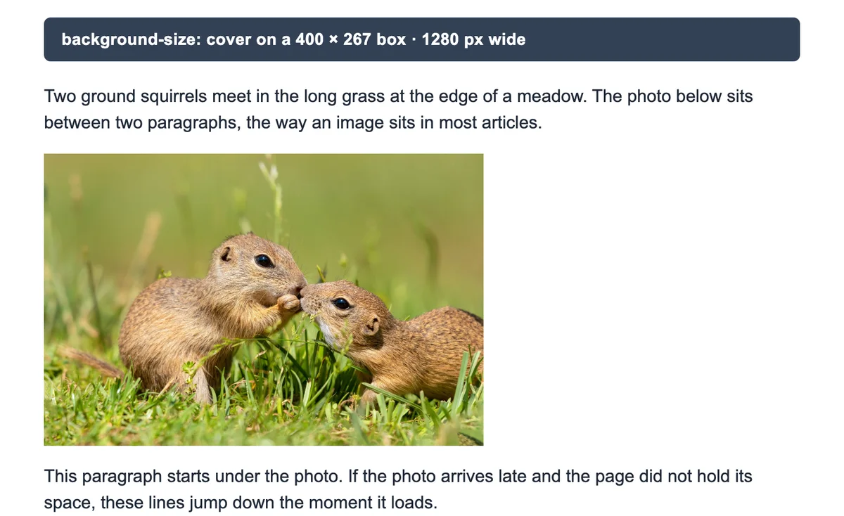
Use a background only for decoration. A background has no alt text, so a screen reader skips the picture. And our background page downloaded the full 652.7 KB, the same as an img.
Two ways to avoid: transform and JavaScript
transform: scale(0.5) shrinks the picture you see, not the space it takes. Our 800 pixel photo drew at 400 × 267, but the page still laid it out at 800 × 534. That left a 283 pixel gap under it.
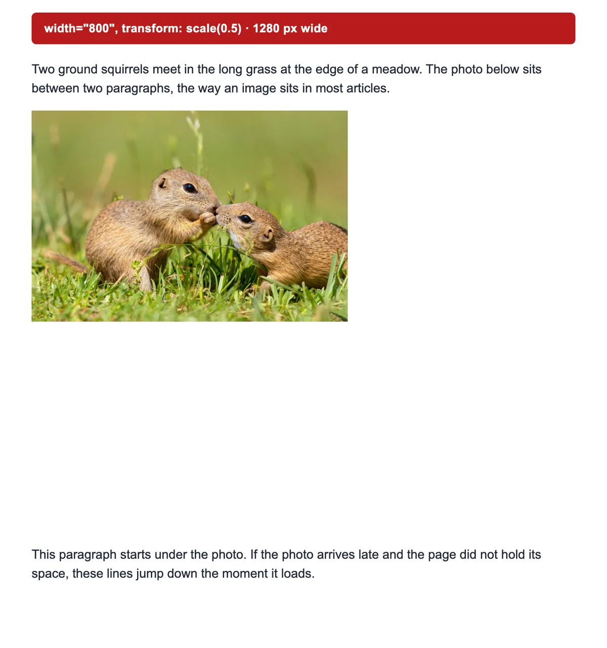
JavaScript can set img.style.width, and the result is the same as the CSS. The script runs after the page draws, though, so the image can jump. Size images in HTML and CSS, and keep scripts for images you create on the fly.
How we tested
- The page: one article column, 720 pixels at most with a 16 pixel gutter, Arial 16 on 24. A paragraph, the photo and a second paragraph; the late-photo pages add 4 more paragraphs below.
- The photo: two ground squirrels from Blinkimg’s own library, 1920 × 1281, a 652.7 KB JPEG. The 400, 800 and 1200 pixel JPEG copies and the 800 pixel WebP and AVIF are Blinkimg’s engine 12 at Auto quality.
- The browsers: Chromium 149, Firefox 151 and WebKit 26.5 through Playwright, at 390, 768 and 1280 pixels wide and pixel densities of 3, 2 and 1, on 2026-11-03. Each page came fresh from a local server, caching off.
- The counts: boxes from getBoundingClientRect and offsetWidth, the file from currentSrc, the bytes from each image response. For the shift, the server held the photo back 1.5 seconds; we read the next paragraph’s top before and after. CLS is Chromium’s own score; Firefox and WebKit report none.
- The rules: from the HTML standard, MDN, web.dev and Chrome’s Lighthouse docs, read on 3 November 2026.
Next step
Add width and height to your img tags, then max-width: 100%; height: auto to your CSS. Then make the file fit the slot: twice the display width, saved with the image resizer. If the image floats and the text wraps around it by mistake, our text wrapping test has the fix.
Read the full guide: Image optimization for the web: formats, sizes and lazy loading.
Questions
- How do I resize an image in HTML?
- Add width and height to the img tag in pixels, with no unit, such as width="400" height="267". Then add max-width: 100% and height: auto in your CSS, so the image shrinks on small screens without stretching. Keep both numbers in the file’s own shape.
- Should I put width and height on every img tag?
- Yes. The browser reads both numbers before the file arrives and holds a box of that shape, so the text below does not jump. In our test, a late photo with no width and height moved the text 239 pixels on a phone. With them set, nothing moved.
- Can I use a percentage in the img width attribute?
- No. The HTML standard allows only whole numbers in the width and height attributes. Browsers still draw width="50%" at half the column, but they hold no space while the image loads, so the text jumps. Put the percentage in CSS instead, where width: 50% is valid.
- Does resizing an image in CSS reduce the file size?
- No. CSS and HTML change only how big the image looks. The browser still downloads the whole file. In our test, Chromium, Firefox and WebKit all downloaded the full 652.7 KB photo to show it 400 pixels wide. Resize and compress the file itself to send fewer bytes.
- How do I fit an image in a div without stretching it?
- Give the image width: 100% and height: 100%, or a fixed aspect-ratio, then add object-fit: cover. The picture fills the box and crops its edges instead of stretching. Use object-fit: contain to show the whole picture with bars on two sides.
- Why does my image look stretched in HTML?
- The width and height do not match the file’s shape. Often CSS sets the width while the height attribute still applies. Add height: auto next to the CSS width, and the browser works out the right height. For a box of another shape, use object-fit: cover.
- What size should an image file be for a web page?
- About twice the width it shows at, so it stays sharp on screens with 2 device pixels per CSS pixel. A photo shown 400 pixels wide needs an 800 pixel file. Use srcset to send a smaller file to small screens and a bigger one to 3× phones.
- Why is my image width not working in CSS?
- Another rule is winning. An inline style beats your stylesheet, and !important beats both. A max-width can also cap the width, because max-width overrides width. A height attribute without height: auto, or a flex row, can change the shape. Check which width rule applies to the image in DevTools.
- What is the difference between the width attribute and CSS width?
- The width attribute is a whole number in the img tag, read before the file loads so the browser can hold the space. CSS width is a style rule that wins over the attribute and takes any unit, such as px, % or vw. Use both: the attributes for the shape, CSS for the size.
- How do I resize an image with JavaScript?
- Set the style in a script, such as img.style.width = "400px" and img.style.height = "auto". The result matches the same CSS rule. The script runs after the page draws, so the image can jump. Size images in HTML and CSS when you can.